As more and more people use their mobile devices to browse the internet, having a mobile-friendly website is more important than ever. In fact, Google has even started to penalize websites that are not optimized for mobile devices. If you want to ensure that your website is accessible and easy to use for your mobile users, here are some tips to optimize your website for mobile.
- Use Responsive Design
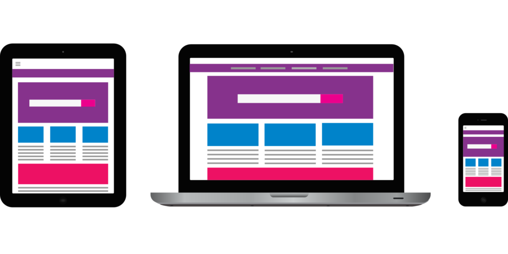
Responsive design is a method of web design that allows a website to adapt to different screen sizes and resolutions. With responsive design, your website will look great on any device, whether it’s a smartphone, tablet, or desktop computer. The website layout and content will automatically adjust to fit the screen size, providing a seamless user experience for your visitors.
- Simplify Your Navigation
Navigation is one of the most important aspects of a website, especially on a mobile device. You want to make it as easy as possible for your mobile users to find what they’re looking for. Simplify your navigation by using a hamburger menu or drop-down menu, and ensure that your menu items are large enough to be easily tapped with a finger.
- Use Large Fonts
Small fonts are difficult to read on a mobile device. Use larger fonts to make it easier for your users to read your content without having to zoom in or squint. A font size of at least 14 pixels is recommended for mobile devices.
- Optimize Your Images
Large, high-resolution images can slow down your website’s load time on a mobile device. Use image compression to reduce the file size of your images without sacrificing quality. You can also use lazy loading to only load images as they come into view, which can significantly improve your website’s load time.
- Minimize Your Content
Mobile users are often on-the-go and looking for quick answers. Keep your content concise and to the point, and break up large blocks of text with subheadings, bullet points, and images. Avoid using pop-ups or interstitials that can be difficult to close on a mobile device.
- Test Your Website
Before launching your mobile website, test it thoroughly on multiple devices and platforms. You can use tools like Google’s Mobile-Friendly Test to check your website’s mobile compatibility and identify any issues that need to be fixed.
In conclusion, optimizing your website for mobile is essential for providing a positive user experience and ensuring that your website ranks well in search engine results. By using responsive design, simplifying your navigation, using large fonts, optimizing your images, minimizing your content, and testing your website, you can create a mobile-friendly website that is accessible and easy to use for your mobile users.